Friday, 2 January 2015

Collagraph

A technique used in my project, in the commence of the Autumn/Winter section, were collagraphs, as they should roughness and look more textural than the delicacy of natural forms in the Spring and Summer months.
Subtle edit of original photo
Over-exaggerated edit with colours representative of Autumn
Firstly, I selected a photo that had colours that showed signs of decaying or the Autumn and Winter seasons approaching, therefore I chose this image as it had earthy colours (yellow, green and brown) in it.

Collagraph board
Collagraph print onto plain white card
My final products of using the collagraph and printing press produced many texturally different pieces that were then ready to develop by adding other materials into them.

Sunday, 14 December 2014

Summer Flower Acrylic Painting

The image I chose for the Summer canvas was a close up photo of a vibrant flower, that I took in June 2014.                                             The reasoning behind my choice was that the colours are bright and powerful, showing the full growth of the natural form.


Unfinished acrylic painting

At this stage of the painting I decided that it was too pink for my liking so I decided to incorporate purples as well, as shown below.
Whilst enduring the process of the painting, I struggled with the proportions of the flower and overestimated how big the outline would be, resulting in the painting covering more or less the whole canvas, which meant it would be more time consuming to complete.

Finished acrylic painting
After finishing the painting, I came to the conclusion that it could be improved more as the detail isn't as good as it could be and the bottom right hand space is bare, it could do with filling up or having a background with relevant colours or shapes.

Thursday, 27 November 2014

Karl Blossfeldt/Jake Muirhead Comparison

Karl Blossfeldt's work


 In comparison with Jake Muirhead's artwork, Karl Blossfeldt's work is refined and detailed despite the fact that the focuses of the work are similar.


Although the precision of the two artists' work are greatly different they both have similar colour schemes and focus points of the natural forms.
Karl Blossfeldt's work


Both of these artists use inverse tones, they either use light backgrounds and shade dark tones into their drawings or prints or they use dark backgrounds with lighter shaded drawings or prints.  
Own photography
Own photography


I took some photos of flowers in my garden that were influenced by Karl Blossfeldt's work as they were close up and you could see the detail in the flowers but I also took photos at different focus points to see if when I printed or drew them they had the same depth and effects.

Wednesday, 26 November 2014

Decaying Natural Forms

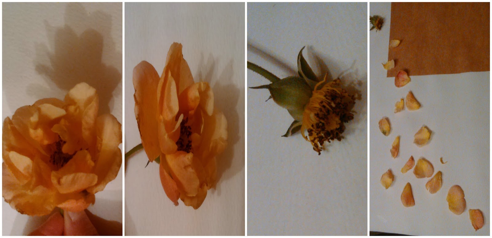
These photos have been taken for my natural forms project at AS Level.
They represent the process of decay, as Summer comes to a close and the Autumn and Winter months arrive.

My interpretation of flowers decaying
Edited version of the collage above, reflecting the attitudes and colour schemes that I imagine when I think of the process of decaying and death of natural forms

The photos are relevant to my work because in the project I am expressing the different colours, shapes and sizes, and the attitudes towards the appearance of flower throughout the course of it deteriorating.
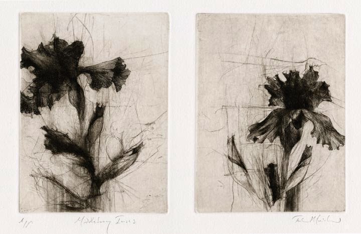
Jake Muirhead artwork
As an inspiration of my work, I looked at Jake Muirhead's artwork and liked the idea of using dark tones and plain backgrounds as it portrays the significance of the process and enhances the focus of the piece. Muirhead's artwork has influenced the colour scheme of the Autumn/Winter seasons in my project and has shown me that imperfect lines and edges reflect the sharp, bitterness of the process in which natural forms deteriorate.